The Context.
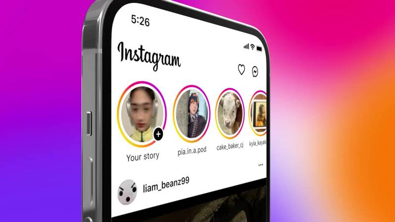
Instagram has grown into a multi-surface product where people come to create, connect, and be entertained. The challenge: keeping the experience intuitive as behavior shifted toward short‑form video and messaging.
Friends and entertainment are the core jobs, yet Reels and Direct still required extra taps. We reframed navigation to make them immediate while preserving the familiar “catch up first” rhythm.
Instagram’s New IA.
A swipeable navigation layer lets people move laterally between tabs, creating a more physical sense of the app. The result feels like adjacent spaces rather than separate destinations.
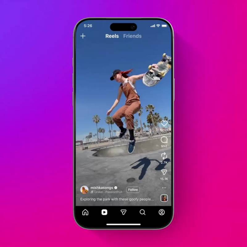
- Reels moves to the second tab for faster entertainment.
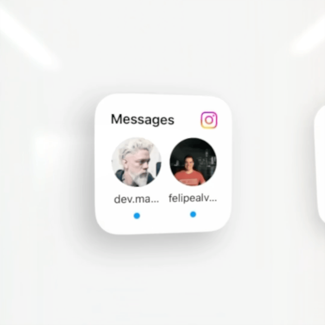
- Direct moves to the center tab—conversations are always one tap away.
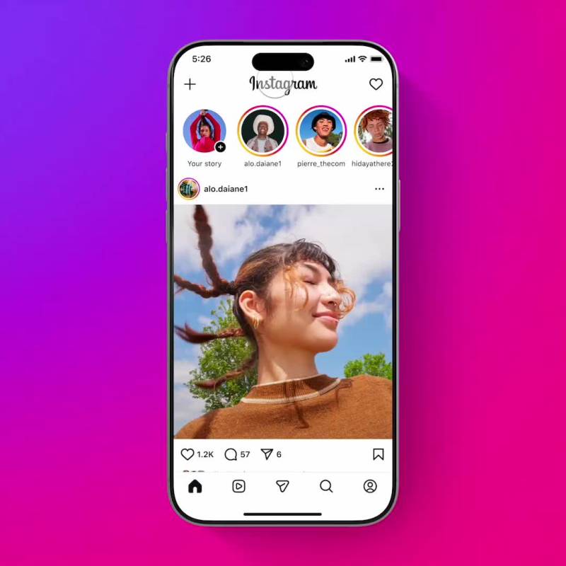
- Create moves to the top-left for faster posting.
- A new badging system replaces dots with jewels and removes Home badging entirely.


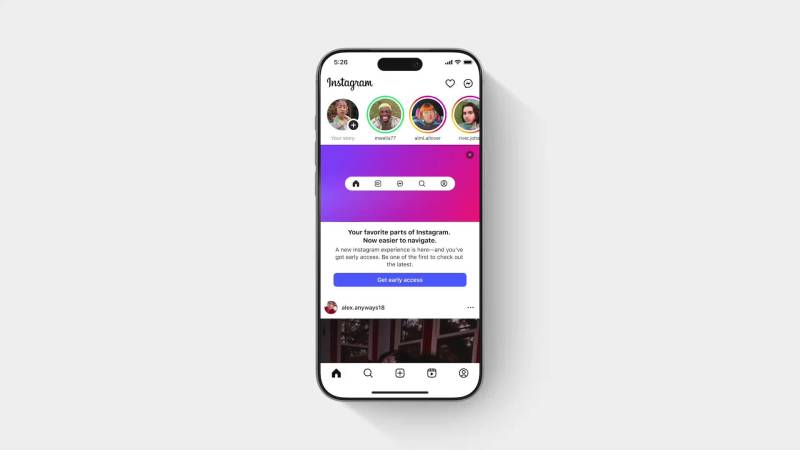
Opt-in and Education.
Navigation changes historically trigger strong negative sentiment. We used an opt‑in rollout—in‑app prompts, an explainer page, and a welcome interstitial—to let people transition on their own terms.
After opt-in, we rolled out at 2.5% of daily active users per day. The launch landed with minimal sentiment impact. Instagram’s CEO, Mosseri, led the public communication.
Why It Was Hard.
We changed layout, navigation, and design in parallel—making it hard to isolate impact. Multi-account users experienced inconsistent states. Android and iOS behaved differently in compounding ways.
Reels‑second and Direct‑in‑nav shifted traffic patterns everywhere, requiring cross‑pillar alignment. Direct had historically depended on Feed as a mandatory stop—removing that path meant rebuilding badging logic entirely.
Impact.
The redesign simplified Instagram’s mental model and reduced friction to Reels and messaging. As of December 2025, the new navigation has shipped to 100% of Instagram’s global users.
Special thanks to Michael Friedman, Ryan Brownhill, Jacqueline Kouri, William Chong, the HomeX team, and so many others.